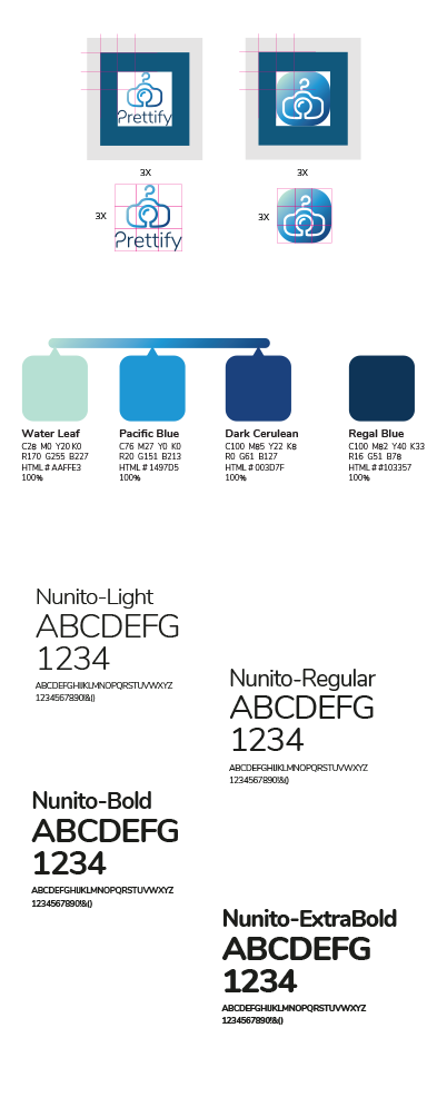

Prettify branding
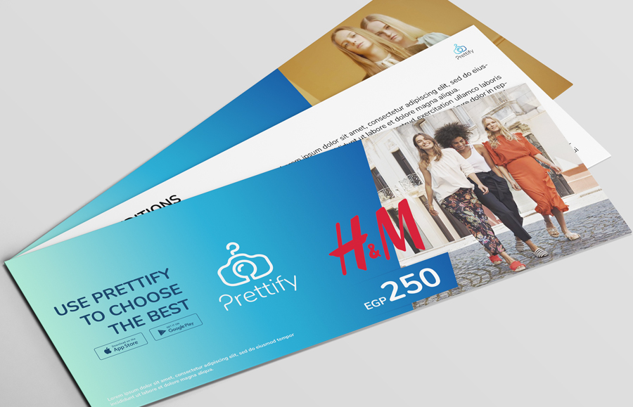
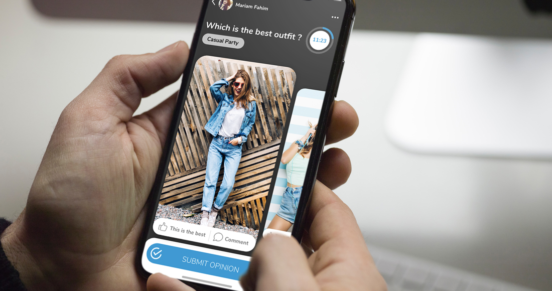
Prettify is a fashion feedback app that helps users choose the right outfit by sharing looks, collecting opinions, and improving style decisions through a simple, social experience.
Logo story
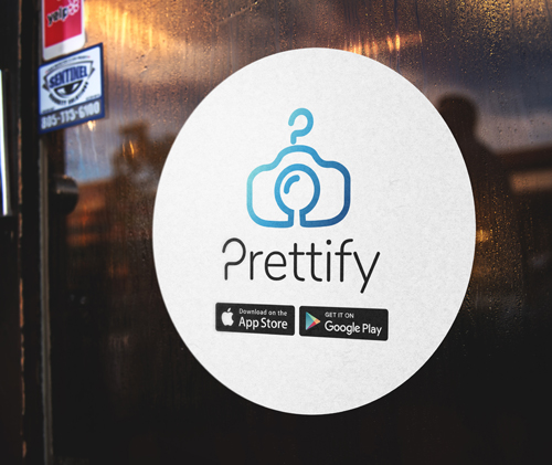
We fused three cues into one mark: a clothes hanger hook for wardrobe, a camera silhouette for instant outfit shots, and a subtle “P” formed in the inner negative space. The rounded geometry keeps it friendly and modern, while the blue gradient adds depth and a premium, trustworthy feel. The result is an icon that reads fast at small sizes and still feels distinctive in full lockup.
Blue Depth, Clean Confidence
The identity leans on a calm-to-deep blue range, supported by a soft mint accent, to signal stability, clarity, and visual appeal. Nunito typography keeps the tone approachable and digital-first. The system stays minimal so the user’s photos and outfits remain the hero.
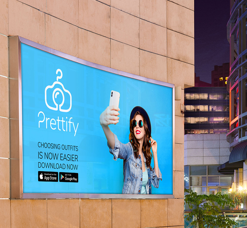
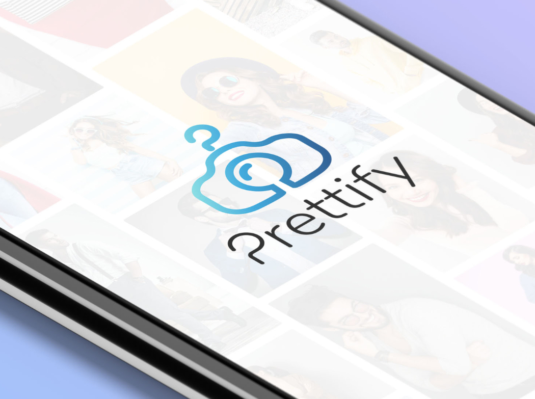
Built for Screens and Stores
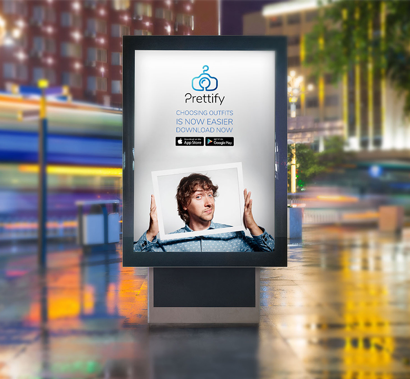
We designed the brand to live where decisions happen: inside the app UI, on social posts, and in real-world touchpoints like stickers and outdoor displays. The icon, gradient, and typography were standardized so every placement feels consistent, whether it is a tiny app badge or a large-format billboard.
Durable by Design
Strong silhouette, limited colors, and clean spacing make the logo resilient across print, embroidery, signage, and dark or light backgrounds. It holds clarity even when the gradient is replaced with a flat single color.