
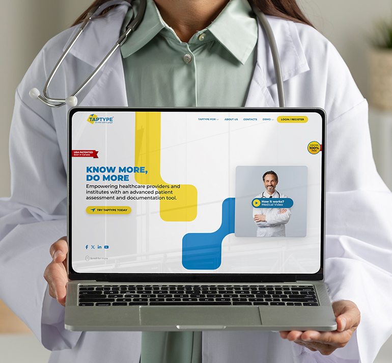
TAPTYPE
The Product Idea & Challenge
A Canadian family physician was drowning in documentation. Templates were rigid, dictation tools still needed cleanup, and nothing matched how a doctor actually thinks mid-consultation. He asked: what if a physician never had to type a single word? That question became TAPTYPE — a patented, click-driven SOAP documentation platform. Road9 Media's brief: make it visible.
Brand Foundation
The healthcare software space is crowded with cold, clinical brands that speak compliance, not relief. We identified the strategic gap: TAPTYPE doesn't just save time — it gives physicians back their attention during the consultation, not after it. That emotional shift became the compass for every design and branding decision.
Giving It a Name
"TapType" captures the core gesture — tapping instead of typing — while inverting the expectation. It sounds like the very thing it eliminates. That tension makes it stick. Short enough for a logo, distinctive enough for a patent filing, intuitive enough to need no explanation in a clinic hallway.
Mark & Meaning
The logo is a document that behaves like software. A tilted paper shape signals clinical documentation; its folded corner becomes a cursor point — a visual metaphor for tap-first charting. Paired with a bold Montserrat wordmark, it scales from a favicon to a conference stage without losing clarity.
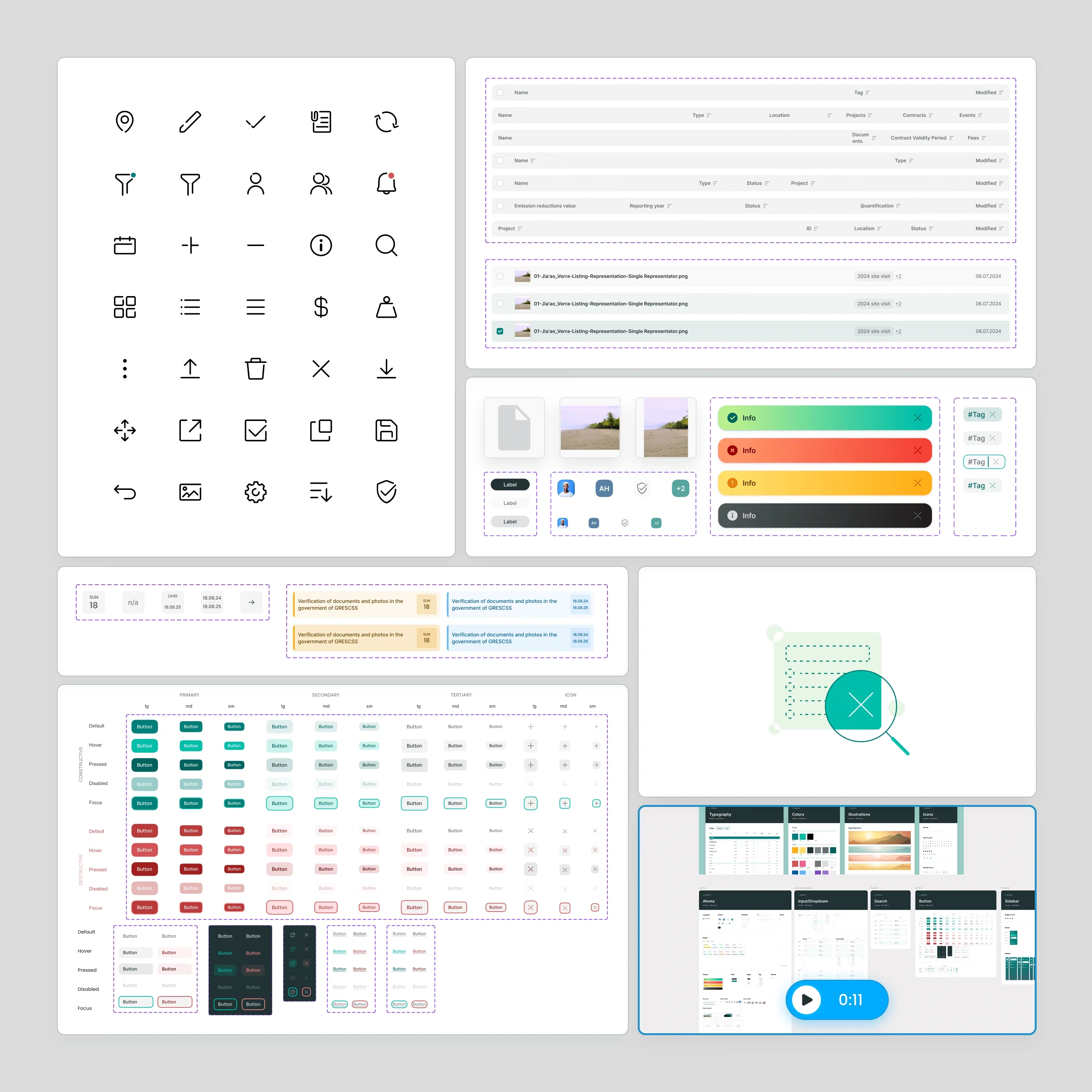
The Design System
Identity built on strategic tension: medical trust versus digital speed. Confident blues for structure, sharp yellow for momentum, clinical whitespace for breathing room. Montserrat typography — authoritative, not cold. Angular "cursor shards" extend the logo into a kinetic design motif across UI, sales decks, conference visuals, and onboarding forms.
Platform Architecture
We designed a multi-role, HIPAA-compliant architecture serving physicians, pharmacists, nurses, and administrative staff — four distinct user types, each with tailored permissions and workflows. End-to-end encryption, audit logging, and role-based access aren't feature add-ons; they're foundational decisions woven through every module and interaction.
Product Experience
The UX reimagines SOAP documentation as a tap-driven flow: four-tab navigation, yes/no clinical toggles, interactive body maps, and pre-visit patient questionnaires that pre-populate 30–60% of the note. Physicians listen to patients instead of screens. The result: 79.2% documentation time saved, zero spelling errors, legally compliant notes by default.
Interface Language
Every label written for two-second comprehension. Progressive disclosure guides users deeper without overwhelming them. Copy speaks to physicians as experts, not beginners. Three-tier tagline architecture: "On the same page" (brand), "Create notes without typing" (product), "Know more, do more" (platform). One consistent voice across the entire ecosystem.
From Design to Product
We took TAPTYPE from naming through brand strategy, visual identity, UX, and SaaS development — each phase informing the next. Research shaped the name, the name shaped the brand, the brand shaped the interface, and the interface became a live platform serving clinics and pharmacies across North America. One connected thread, zero gaps.