

Your website might look great on a 27-inch monitor at the office, but that’s not how most Egyptians will experience it. Two-thirds of all web traffic in Egypt comes from mobile devices, so you should no longer treat mobile sites as an afterthought. If you do, you’re practically holding the door open for 61% of users to leave and find a competitor instead.
Road9 Media, a leading web design agency in Egypt, unpacks what a mobile-first approach means, why it's essential for success in the Egyptian market, and practical steps to create a mobile experience that turns visitors into loyal customers.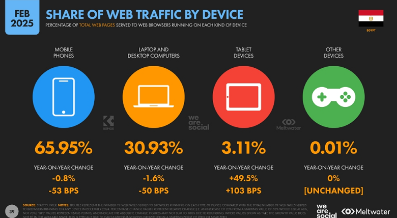
What is Mobile-First Design?
Mobile-first web design is exactly what it sounds like: designing a website to be viewed on mobile phones first, then scaling up for larger screens like tablets and desktops. Instead of building a feature-rich, content-heavy website and trying to squeeze it onto smaller screens, mobile-first prioritizes simplicity and usability from the start.
Curious how local brands are adopting mobile-first web design in Egypt? Here's our list of top online stores making waves this year.
Core Principles of Mobile-First Design
I. Content Priority: Essential information (e.g., calls-to-action, key services) is front and center to avoid clutter.
II. Performance Optimization: Lightweight code, compressed media, and lazy loading (more on those later) to accommodate slower networks.
III. Touch-Friendly UI: Larger buttons and minimal text input for effortless thumb navigation.
IV. Responsive Scalability: Adapt fluidly to larger screens without sacrificing mobile usability.
Desktop-First Design (Graceful Degradation)
Before mobile phones became the staple they are today, desktop-first (also called graceful degradation) was the standard approach to web design in Egypt and around the world. Developers would first build a feature-rich website for desktop computers, then strip away or modify complex elements to fit smaller screens.
The issue with graceful degradation became clear as the number of mobile users surpassed desktop browsers: Mobile users received a scaled-down version of a site that wasn't built with them in mind. The end result was slow load times, frustrating navigation, and a poor overall experience.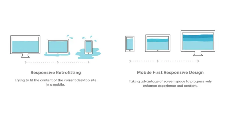
Are There Situations Where Desktop-First Is Still Appropriate?
- Data-Heavy Enterprise Software: Platforms with complex dashboards (e.g., analytics tools, HR systems) often require a desktop-first approach due to screen space limitations.
- Advanced Web Applications: Certain tools (e.g., video editing software) may not yet offer full functionality on mobile.
- B2B Services: If your audience primarily uses desktops during business hours, it might be beneficial to design for these users first.
How Mobile-First Design Impacts Business Success in Egypt
Your company website exists to introduce potential customers to what you have to offer, keep them engaged, and ultimately drive the actions you want them to take. Since smartphones are the primary gateway to the internet in Egypt, how your mobile website performs will directly affect how customers react and interact with your brand. Here are three core reasons why mobile-first design is a must:
1. Mobile-First Design Has a Measurable Impact on Revenue
Deloitte published a report titled Milliseconds Make Millions. The study examined how improvements to mobile site speed positively affect a brand's bottom line. They found that a 0.1-second improvement in mobile load speed resulted in a 5.2% increase in page views per session and a 9.2% increase in average order value. Additional data from Google shows that 53% of mobile visitors abandon a page if it takes more than 3 seconds to load.
2. Mobile-First Design is Critical for SEO
Since 2019, Google has implemented mobile-first indexing, meaning it ranks your website based on its mobile version, not the desktop version. Google also evaluates performance using mobile-based metrics like load speed and visual stability. Since poor mobile usability affects dwell time, bounce rate, and page experience (all key SEO factors), a website with suboptimal mobile performance will rank much lower in search results. After all, Google won't recommend an unpleasant user experience to its users.
As a top-tier web development agency in Egypt, we address these ranking factors and more to help you improve visibility. Here are the 9 SEO strategies we use to help Egyptian businesses rank higher in local search.
3. Mobile Experience Influences Customer Loyalty
How many of us have actually revisited a mobile website that was so frustrating we had to leave the first time around? That rarely happens. In fact, people who have a negative experience on mobile are 62% less likely to make a future purchase from the same place. Mobile users are less tolerant of friction. They're quick to leave sites that are hard to use or slow to load, and quick to reward sites that offer speed and clarity.
Browse our web design portfolio to see how we bring mobile-first design strategies to life across different industries.
How to Design a Mobile-First Website for Your Business in Egypt
Effective web design in Egypt requires understanding how users interact with your site under real-life conditions. Here's how to create an effective mobile-first website tailored for Egyptian businesses:
1. Structure Your Content for Small Screens
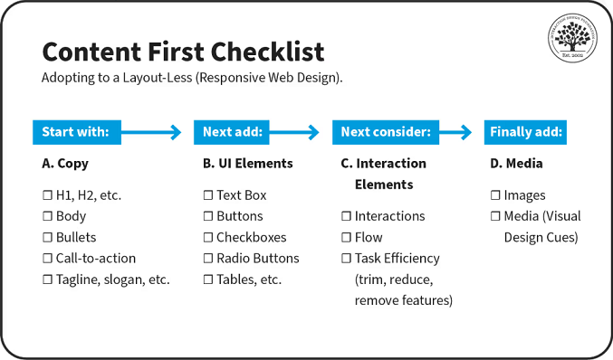
- Start with essential content: Since mobile screens have limited space, focus on delivering key messages first. Use a hierarchical structure that presents crucial information at the top and expands downward.
Road9 Media is a leading web development agency in Egypt with expert copywriters who will help you translate user habits into content that converts. - Use short, scannable text: Egyptian users, like most mobile users, prefer quick, easily digestible content. Keep sentences concise, use bullet points, and break up long paragraphs. Avoid large walls of text.
- Localize your content: Ensure your website supports Arabic and English, as many Egyptians switch between the two languages when browsing. Understanding Egyptian culture and its impact on branding is crucial for creating content that connects with locals.
2. Optimize for Egyptian Internet Speed
- Minimize heavy elements: Compress images using modern formats like WebP or AVIF (they reduce file size without losing quality). Enable lazy loading for images and videos so they only load when needed and remove unused CSS and JavaScript.
- Avoid autoplay videos with sound: Always provide a static preview or thumbnail instead of auto-playing content. Let users choose whether to play videos or not.
- Limit third-party scripts: Too many plugins (like chat pop-ups or analytics tools) can decrease load speed. Audit and remove any third-party scripts that aren't essential or use lightweight alternatives.
- Use a Content Delivery Network (CDN): A CDN serves content from servers closer to the user to reduce latency. Popular options include Cloudflare and Amazon CloudFront. Keeping load times short is an essential principle of smart mobile web design in Egypt.
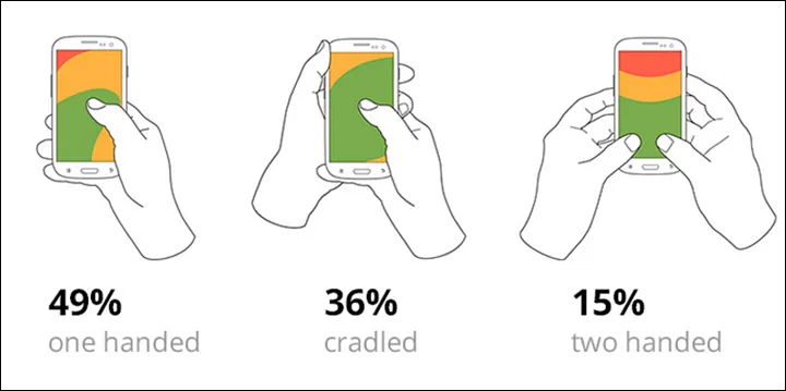
3. Design for Touch and Thumb Navigation
- Use big, tap-friendly buttons: Aim for a minimum size of 48x48 pixels and add enough spacing between buttons to prevent accidental taps. Our guide on achieving an inclusive and accessible web design in Egypt offers practical steps to ensure your site works for everyone.
- Stick to thumb-friendly layouts: Keep key actions (like navigation, CTAs, and menus) within the "thumb zone" (typically the lower center and bottom of the screen) and avoid placing critical elements in hard-to-reach corners. Partnering with an experienced web design agency in Egypt ensures that thumb-friendly navigation is applied from the very start.
- Avoid hover-based actions: Unlike desktop sites, mobile users can't hover over elements to access more information. Replace them with visible indicators, toggles, or expandable sections that open with a single tap or swipe.
Conflicted between a custom design and a template? Our breakdown of templates vs custom web design in Egypt can help you make the right call for your business.
4. Implement Mobile-First SEO Best Practices
- Use structured data (schema): Mark up addresses, phone numbers, products, and business types, especially for local SEO.
- Optimize for voice search SEO: Around 12% of Egyptians use voice assistants in both Arabic and English every week. Include conversational phrases in your content to reach them easily.
- Make content easily readable: Use at least 16px font sizes, avoid tiny links, and check for good contrast (especially for reading in bright sunlight).
- Implement bilingual SEO: Use bilingual meta titles and descriptions when targeting Arabic and English search traffic, and don't forget alt-text for images in both languages. Strong mobile SEO is a specialty among high-performing agencies that handle both web design and web development in Egypt under one roof.
5. Streamline Checkout and Lead Generation
- Mobile users are quick to abandon complex or time-consuming processes. If you're running an e-commerce website, you should note that every extra step or form field to fill can mean a lost customer.
Learn how to design e-commerce websites with Egyptian consumers in mind in our guide, UX principles for e-commerce in Egypt. - Keep forms short: Use auto-fill, location detection, and country code pickers. Only ask for what's absolutely necessary to complete the goal.
- Offer trusted payment methods: Cater to Egyptian preferences with Vodafone Cash, cash-on-delivery, and other familiar payment gateways.
- Use progress indicators in checkout: Let users know where they are in the process (e.g., Step 1/3: Delivery Info → 2/3: Payment → 3/3: Confirm).
We've compared WooCommerce vs Adobe Commerce and WooCommerce vs Shopify with Egyptian brands in mind to help you find the e-commerce platform that best suits your needs.
Common Mobile-First Web Design Mistakes to Avoid
Great websites can underperform on mobile when a few key missteps go unnoticed. Here are four mobile-first mistakes to watch out for and what you can do to fix them:
1. Assuming Everyone Has Fast Internet
Many Egyptians use slower networks or unstable mobile data. A site that loads instantly on your office Wi-Fi won't necessarily work as smoothly for them. Not taking that into consideration may lead to frustration and high bounce rates.
The fix: Use compressed, modern image formats and lightweight scripts, and always test performance on slower network settings to make sure your site works well under real conditions. A trusted web design agency in Egypt will always account for these scenarios during development and QA.
2. Overusing Pop-Ups
Fullscreen pop-ups that are hard to close are a surefire way to send your visitors running. Plus, Google penalizes intrusive elements that interfere with user access.
The fix: Replace them with slide-in banners or small prompts, and make sure the close button is easy to see and tap on any screen size.
3. Using Fonts That Don’t Scale Well
Some fonts look beautiful on a desktop but lose their charm or even legibility on mobile. Arabic fonts require careful font pairing to maintain readability on smaller screens.
The fix: Choose screen-friendly fonts like Cairo or Tahoma and stick to a minimum 16px font size to ensure legibility across devices and languages.
4. Testing Under Ideal Conditions Only
Designing for the latest iPhone might make your site look and feel great to you, but a large portion of your audience is actually browsing on Android phones with modest specs and limited memory instead.
The fix: Test your site on a mix of older and newer devices with different screen sizes to ensure consistent usability for all audiences. This practical, inclusive testing is a hallmark of any qualified web development agency in Egypt.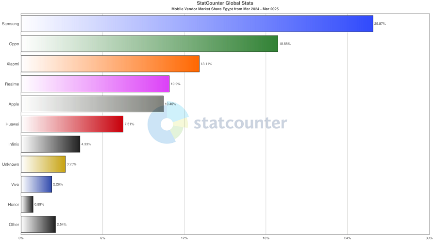
Samsung, Oppo, and Xiaomi are the country's three most used mobile devices. Effective web design in Egypt should account for how sites display and perform on them.
Road9 Media is a web design agency in Egypt that builds for how people here use the internet: on the go, using mobile data, and in multiple languages. Whether starting from scratch or improving an existing site, we’ll help you create a faster, smarter, and more intuitive experience.
Want a website that performs just as well on the street as in the office? Get in touch with us today, and let’s build something great together!