
Ganoubia Hora NGO Branding
Brand identity for Ganoubia Horra, an Aswan-based feminist foundation advancing gender equality through community programs, research, and campaigns, giving Southern women a bold, recognizable public voice.
Logo Concept
Sun, Soil, and Sharpness
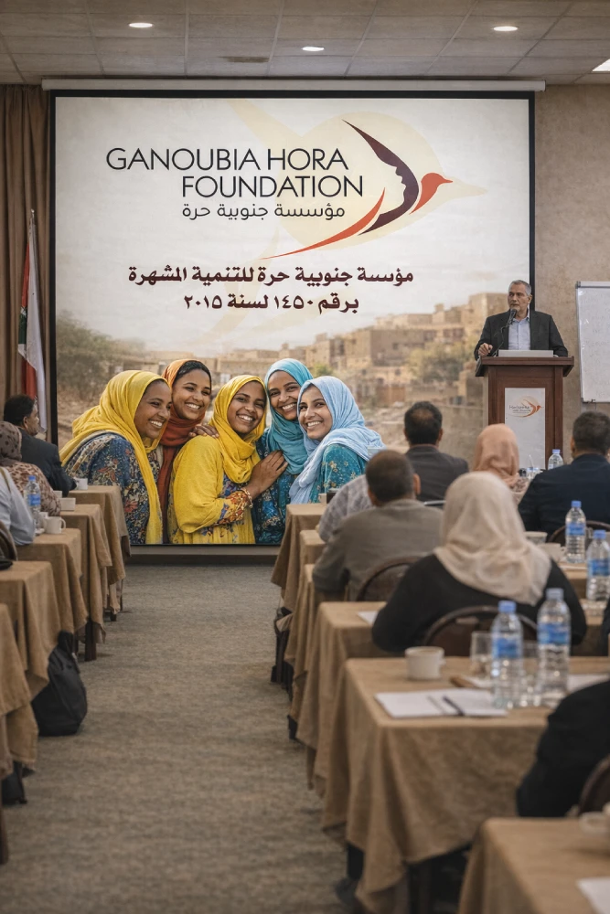
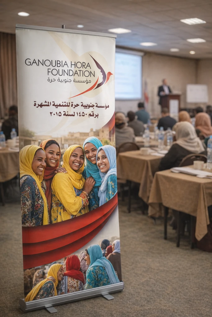

Built for Campaigns and Community Work
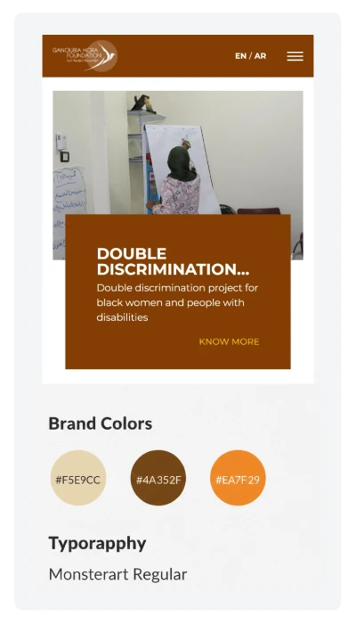
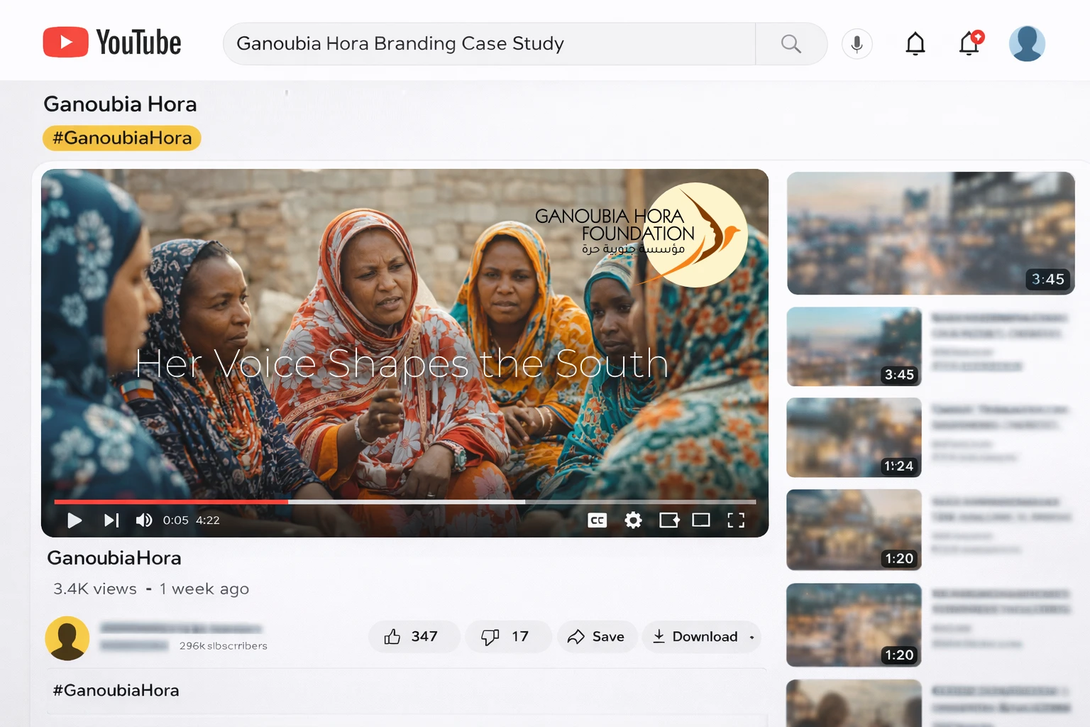
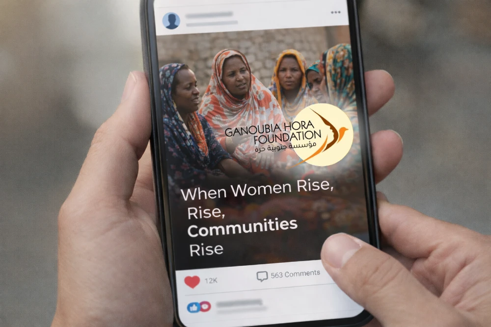
We built a flexible identity kit that works for campaigns, workshops, and research output. The sun circle frames headlines, the wing pattern guides composition, and the palette supports both photo-led and text-heavy pieces. From event posters to policy PDFs and social posts, every asset stays unmistakably Ganoubia, even when produced fast and in small teams.
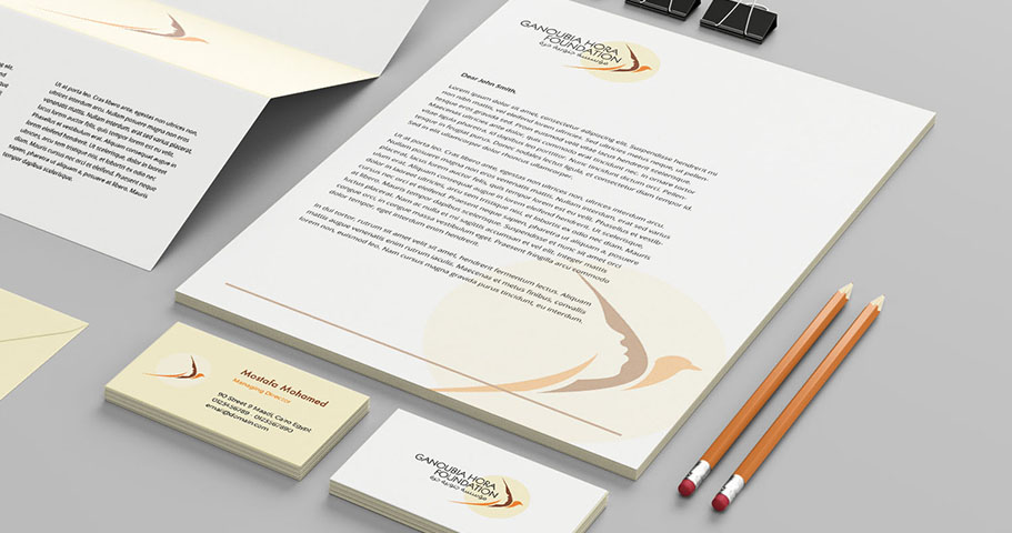
Durable by Design
The mark holds its meaning in one color, in small sizes, and on low-quality printing. Bold shapes, clear negative space, and bilingual typography keep legibility intact, whether it’s a stamp, a favicon, or a banner.