Close menu
/

The Medical Store Visual Identity

The Medical Stores is a hybrid online and storefront destination for medical equipment, built to feel reliable, modern, and easy to access for both walk-in customers and home delivery buyers.

The Medical Store Visual Identity

A Heartbeat You Can Shop From

The icon fuses an “M” with a heart to turn the brand name into a promise of care. A stethoscope line completes the form, linking clinical credibility with everyday purchasing. The shopping bag silhouette keeps it retail-first, while the medical cues make it instantly recognizable as a healthcare supplier, not a generic store. The result is a friendly mark that still signals professionalism and safety.

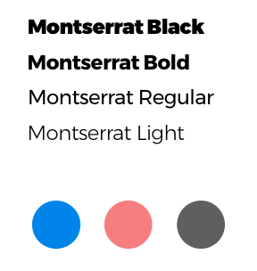
Clinical Clarity, Human Warmth

The palette balances trust and approachability: bright medical blue anchors credibility, coral adds warmth and reassurance, and dark gray supports legibility. Montserrat reinforces a clean, modern tone across print and digital touchpoints. The system stays minimal to keep the focus on product clarity and brand confidence.
The Medical Store Visual Identity
The Medical Store Visual Identity The Medical Store Visual Identity

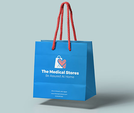
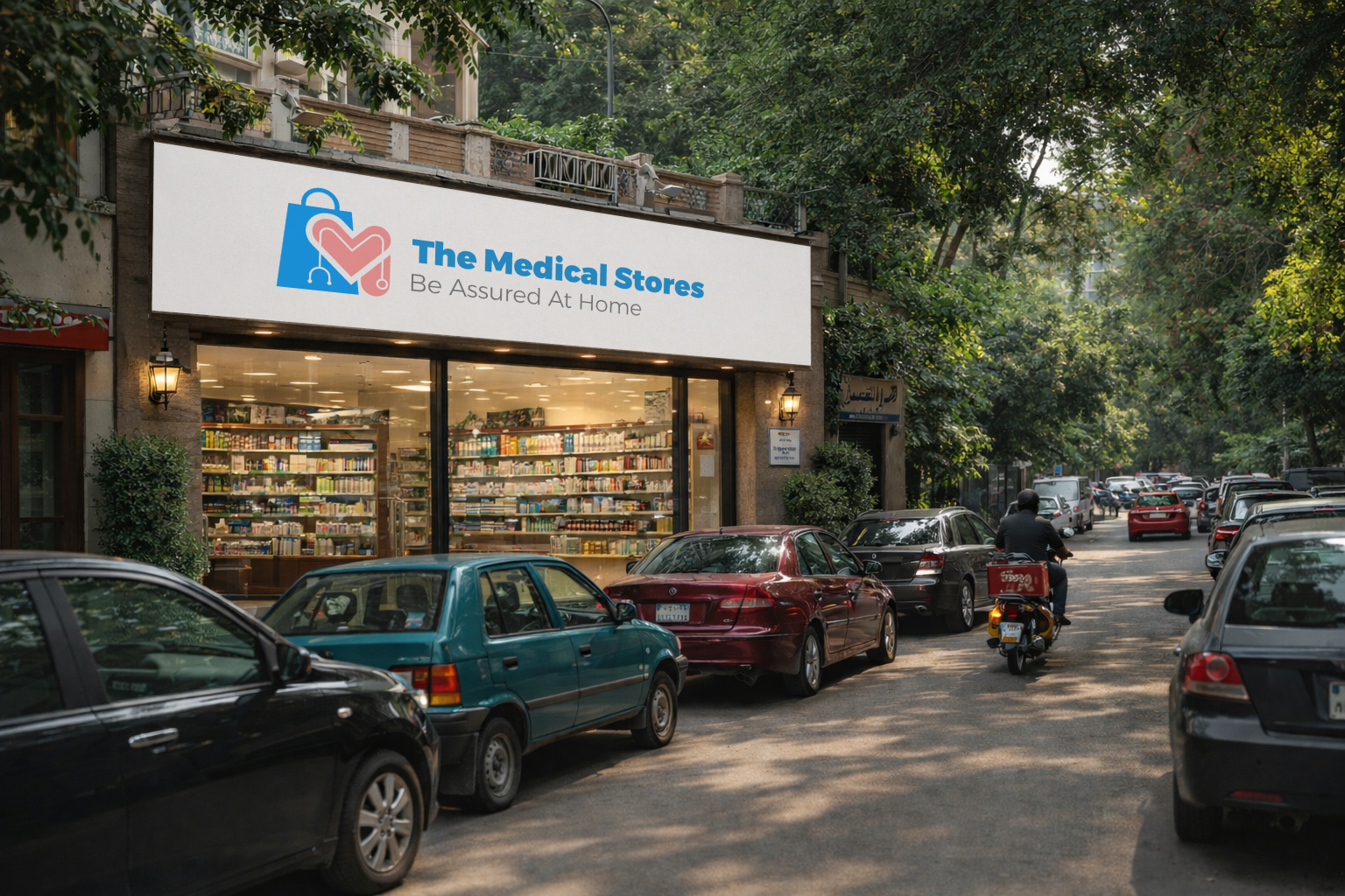
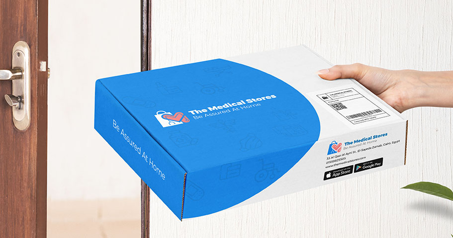
Designed for Delivery, Built for Shelf

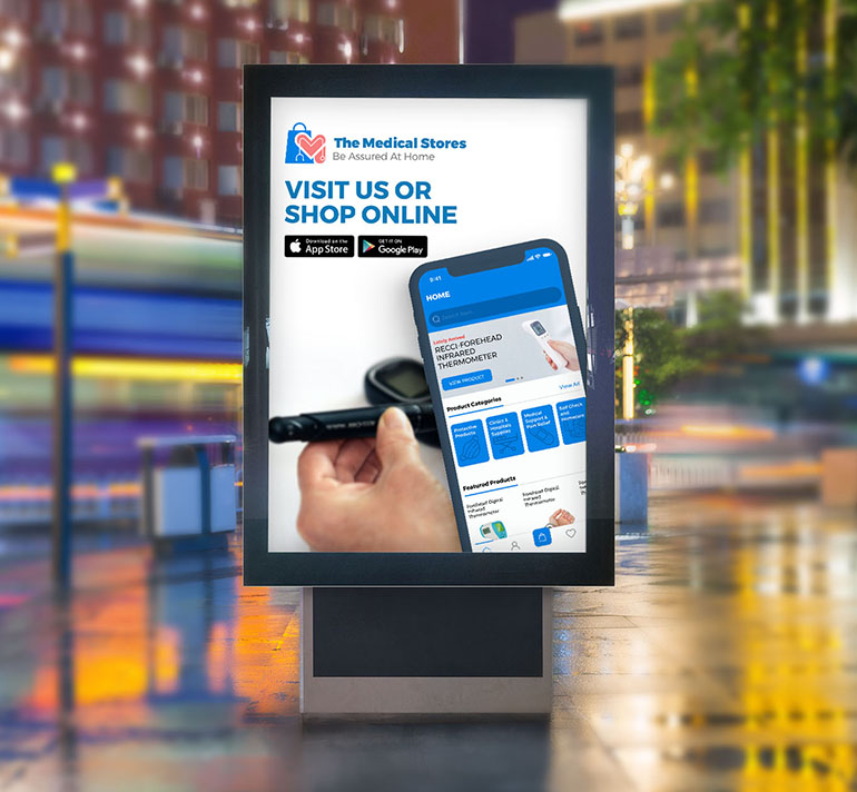
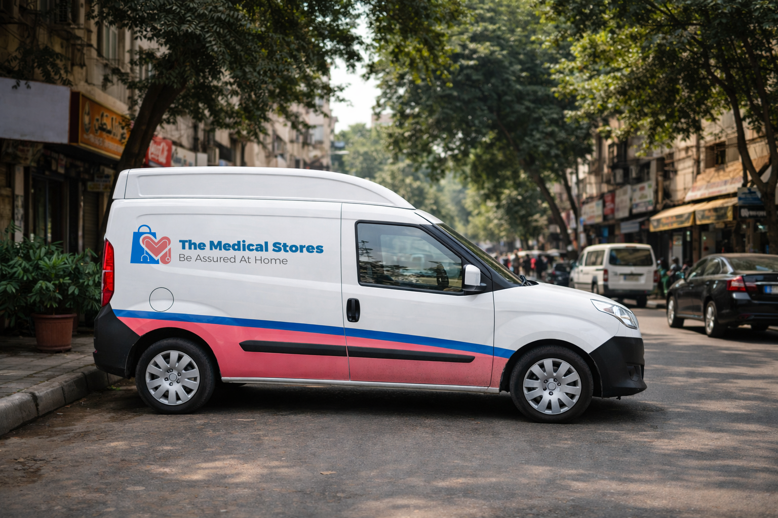
We planned the identity to work in real retail moments: packaging that reads fast at the door, store materials that stay clear from a distance, and a digital look that scales smoothly from app icons to web banners. The subtle medical line-pattern supports large surfaces like boxes and wraps without fighting the logo, keeping everything branded but not noisy.

Simple Shapes, Strong Recognition

The mark is built from bold, readable geometry with a clear silhouette. It stays identifiable in one color, small sizes, embroidery, and print. The icon can stand alone when space is tight without losing brand recognition.

The Medical Store Visual Identity
The Medical Store Visual Identity The Medical Store Visual Identity