
Denta Quick: Dental Equipment Online Store
DentaQuick is an Egyptian dental marketplace that lets clinics restock supplies in minutes. We built a complete visual identity and an e-commerce UX that feels fast, clean, and trustworthy.
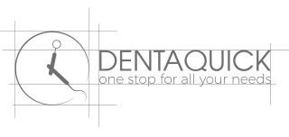
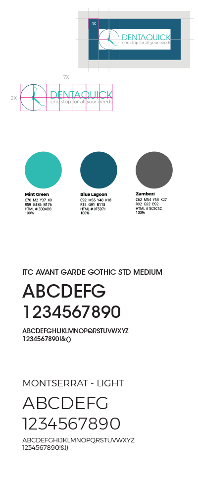
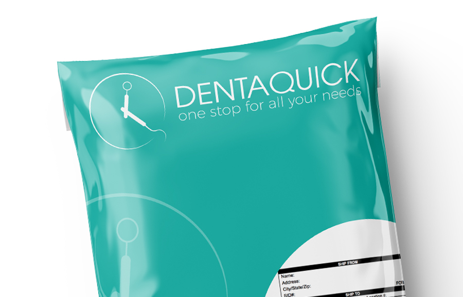
Logo Concept
The mark turns a dental instrument into a clock, a direct cue for speed and readiness. The circular head reads as a timepiece, while the “hands” echo familiar clinic tools, linking dentistry to the promise of quick ordering and delivery. Paired with a crisp wordmark and the line “one stop for all your needs,” the logo communicates a modern supplier that helps dentists stay on schedule, not chase stock.
Clinical Calm, Retail Energy
We built the identity on a clean medical base, then gave it retail momentum. Mint green carries freshness and clarity, deep blue adds trust, and neutral gray keeps the system grounded. Bold geometry, generous whitespace, and sharp type choices keep product-heavy layouts readable and premium.
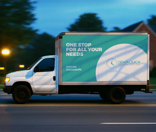
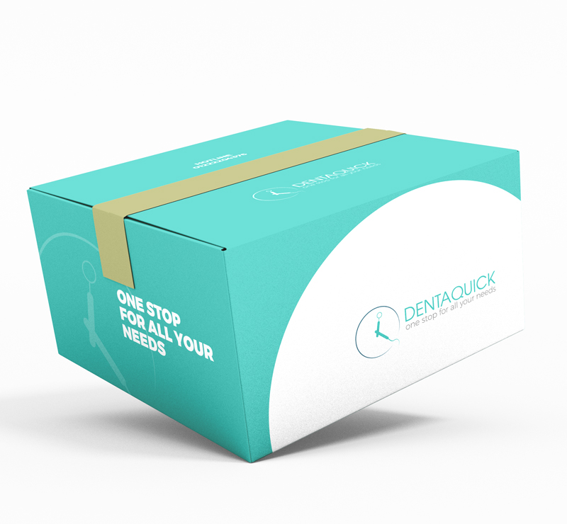
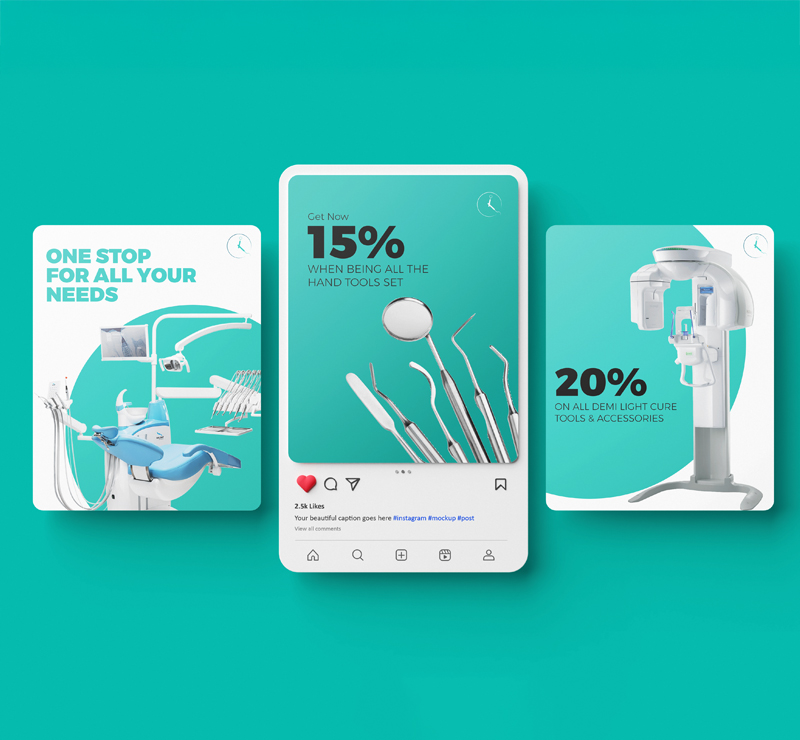
Built to Live Everywhere
The clock icon was designed to scale from a tiny UI badge to a hero centerpiece. We reused the same circular shapes, spacing logic, and color blocks across website banners, offer tiles, and social templates, so every touchpoint feels like one system, not separate designs stitched together.
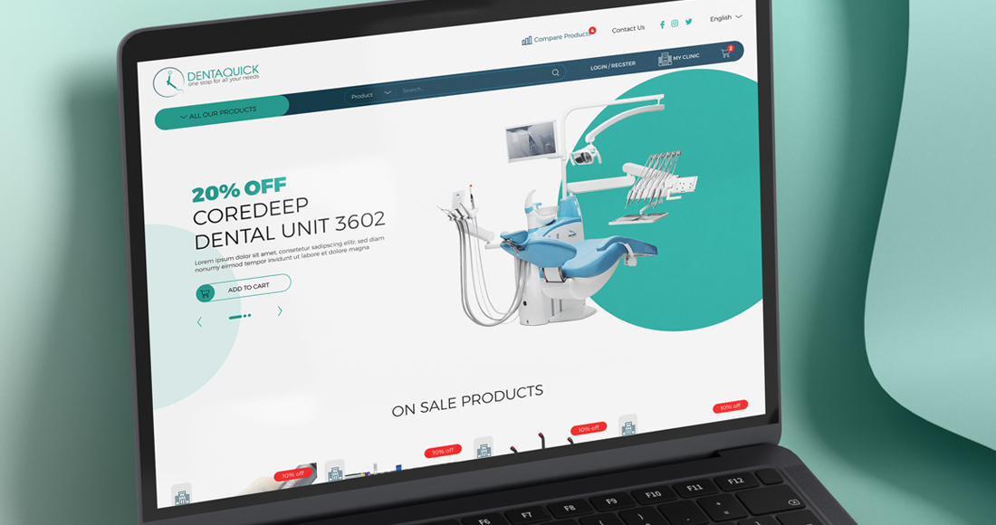
From Brand to Checkout
Beyond the full visual identity, we designed the e-commerce platform UX and integrated the brand into the interface, shaping key screens, promo layouts, and core shopping flows to match the “fast, one-stop” promise.