
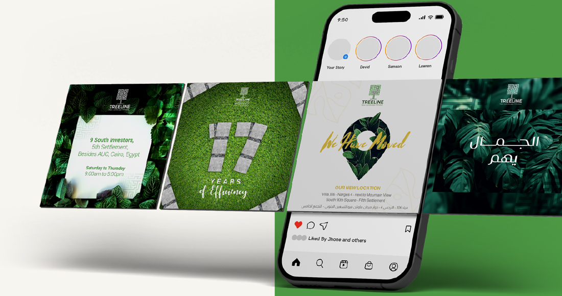
Treeline Landscape complete visual identity & online branding
We developed Treeline Landscape’s visual identity for an Egypt-based landscape and swimming pool contractor, positioning them as end-to-end partners from design to implementation across projects of any scale.
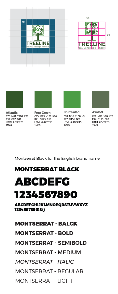
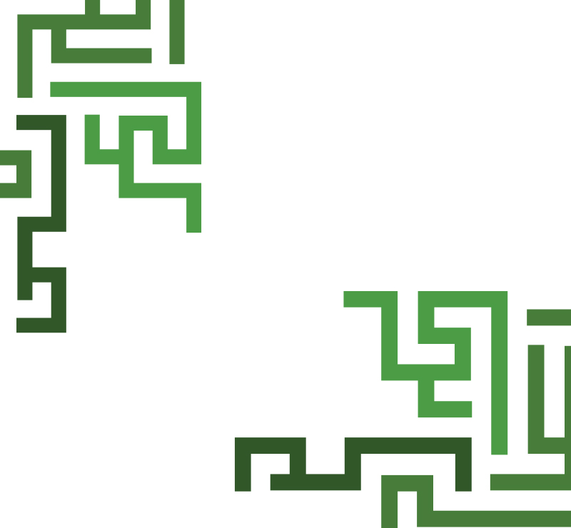
The Treeline Labyrinth
The logo is built from maze-like lines to represent the reality of landscape execution: complex layouts, routes, levels, irrigation lines, and on-site constraints that must still resolve into something clear and buildable. Those paths are shaped into a bold T, doubling as a stylized tree trunk and canopy to connect directly to the name “Treeline.” The result communicates structured thinking, precision, and control, matching a team that delivers integrated landscape and pool work from concept to site delivery across Egypt.
Engineered Greens
We anchored the system in a disciplined green palette, moving from deep, grounded tones to brighter growth notes, so the brand feels both technical and alive. Montserrat keeps the wordmark sharp and modern, while the geometric icon gives the identity a strong signature that works cleanly in flat color and small sizes.
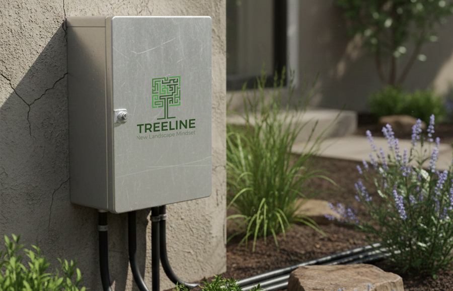

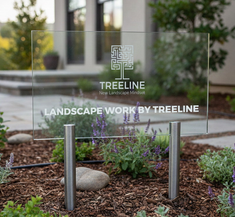
Built for the Site
We designed the identity to live where Treeline’s work is seen: on-site equipment, garden signage, and project labeling. The mark stays legible in a single color on metal, glass, or print, and the clear-space rules keep it readable in busy outdoor environments and real installations.
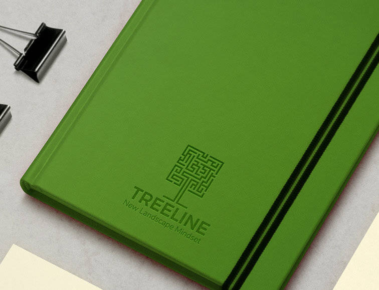
Simple, Lasting, Ownable
The icon is durable because it is structural, not trendy: a geometric symbol that scales, prints in one color, and remains recognizable when etched, reversed, or reduced. Paired with a clean type system, it is built to last.