
Sahara Schools Visual Identity
We modernized Sahara Schools’ visual identity and digital presence, unifying three campuses under one confident system that feels caring, academic, and built to last.
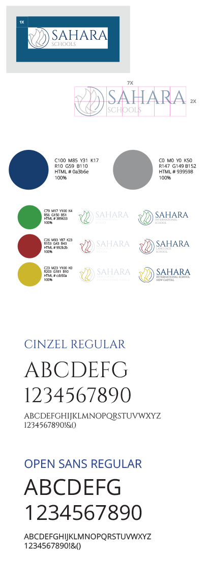
Brand story
Sahara was already known for its dove, so we kept it and rebuilt it. The mark became cleaner, more balanced, and easier to reproduce at any size. The dove’s upward motion signals growth and aspiration, while its calm silhouette reflects care, safety, and trust, which are central to the school’s values and long-standing reputation.
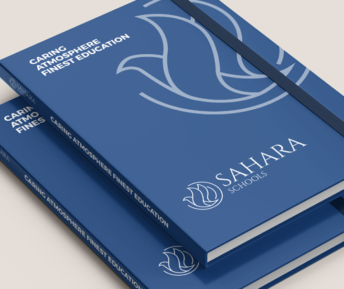
A System, Not a Sticker
We developed a complete identity system around a timeless wordmark and a disciplined palette, then extended it into three campus variations. Each campus keeps the same core brand, but gains a distinct color cue for fast recognition across print, uniforms, signage, and digital touchpoints.
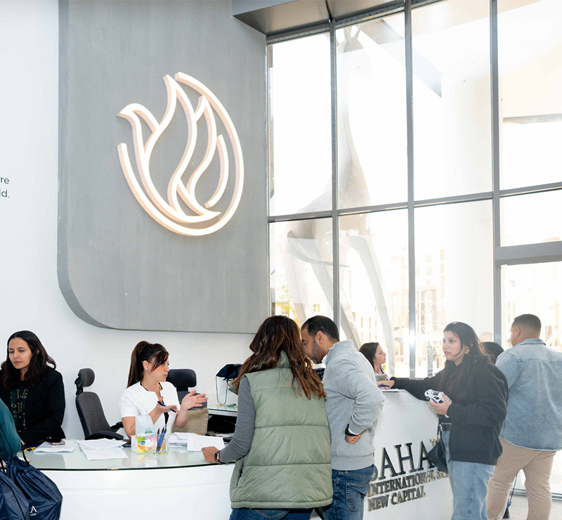
Built to Live Everywhere
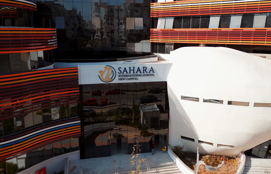
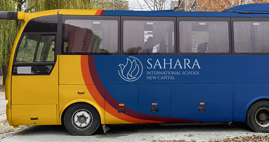
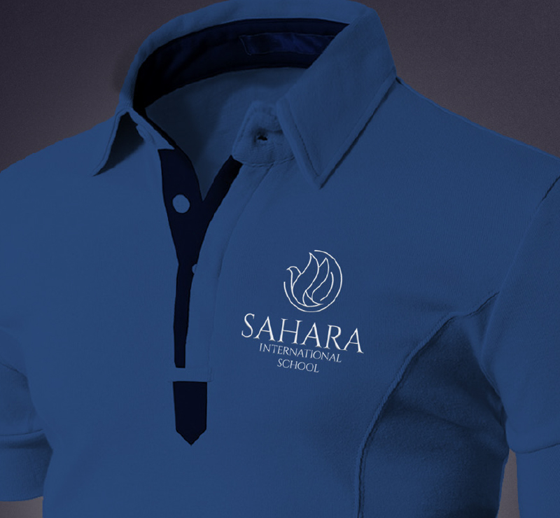
We designed the logo to behave like a true institution mark: readable in a one-color stitch, elegant as a subtle watermark, and strong enough for large-format applications. From notebooks and uniforms to vehicle graphics, the system stays consistent, legible, and unmistakably Sahara.
One Brand, Three Campuses, One Digital Home
Beyond the main logo, we created three official variations, each with its own color scheme and branding manual. In parallel, we redesigned the school website experience and developed it to match the new identity across every key journey.