Family Fine Foods Branding
Family Fine Foods is a healthy food maker and retailer built for real kitchens. We delivered the brand name system and a full visual identity that feels premium, not pretentious.

Concept
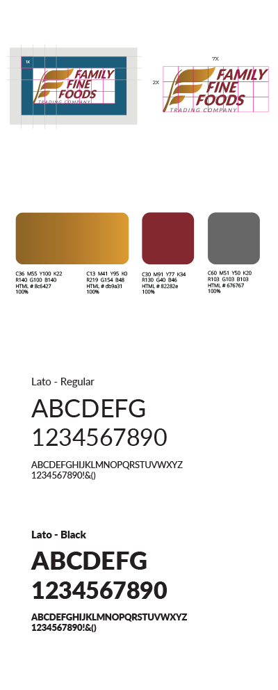
Brand visual identity: “Wholesome, With Weight”
Implementation thinking: “Built for Packaging Reality”
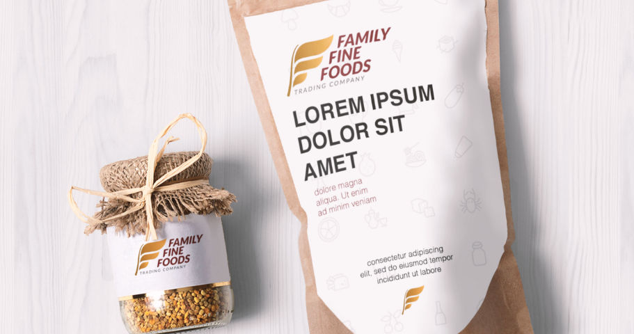
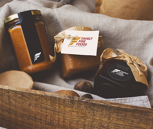
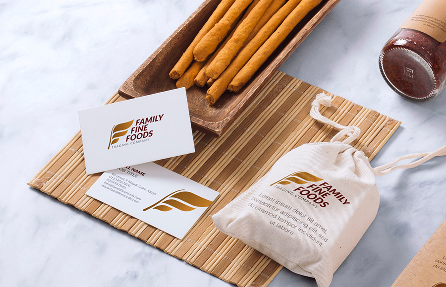
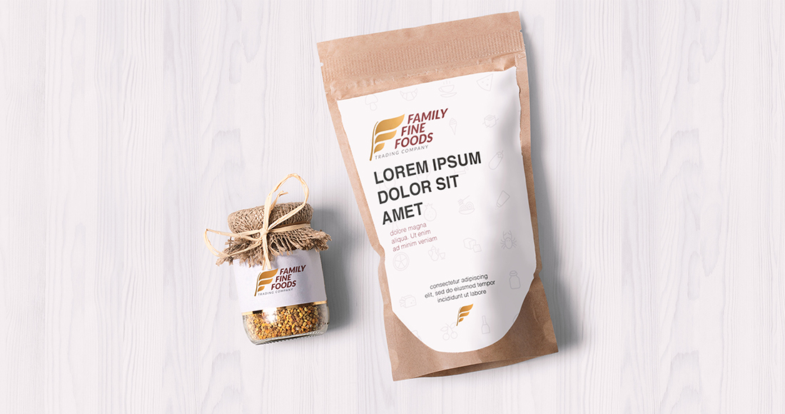
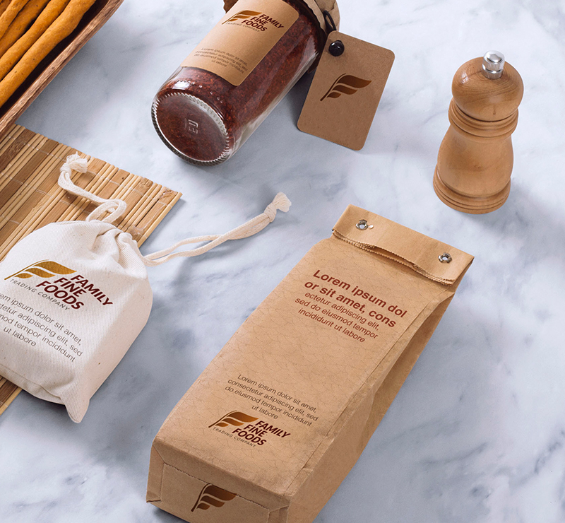
We built the system to live comfortably on real packaging materials: kraft paper bags, jar labels, hang tags, cotton pouches, and seal stickers. The “F” icon can stand alone for small spaces like caps and tags, while the full lockup anchors hero placements. The palette works in full color, foil, or single-color stamping, so production stays consistent across suppliers.
A Mark That Scales
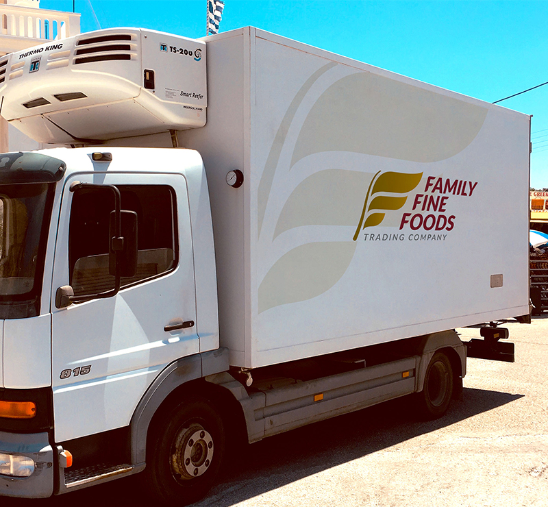
The mark stays strong at every size because it is simple geometry with a clear silhouette. It prints cleanly in one color, holds up on textured kraft, and scales from a tiny tag icon to storefront signage without losing recognition.
