
Bergmanns B.V corporate visual identity
Brand refresh for Bergmanns BV, a Netherlands-based supplier of dredging and marine spare parts, built to signal technical expertise and global logistics for keeping shipping lanes operational.
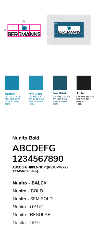
Logo concept
Industrial Tide Palette
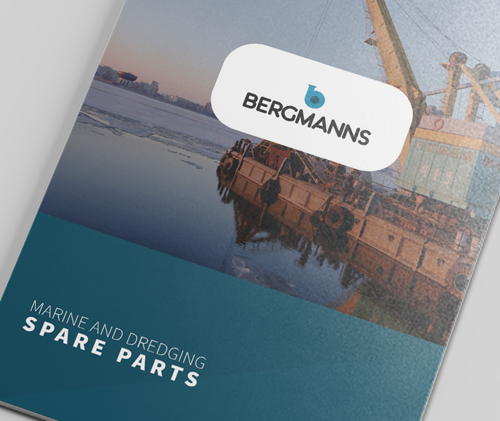
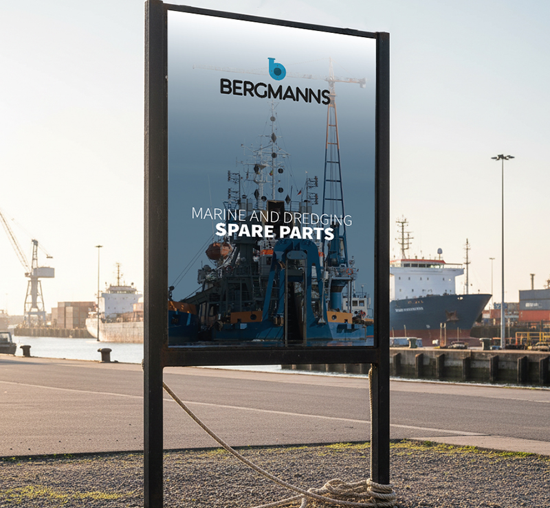
Built for the Dock
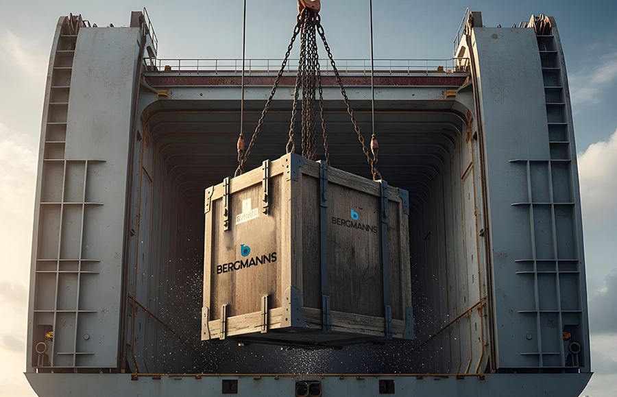
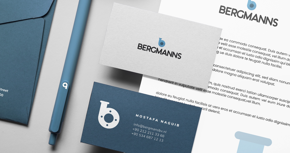
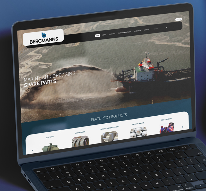
We designed the identity to live where Bergmanns actually operates: on crates, part tags, and shipment paperwork that move through ports and ship holds. The icon can stand alone as a stamp, the full lockup stays stable inside a label frame, and the limited palette prints reliably on wood, metal, and screens without losing recognition.
Long-Service Mark
This logo is built on basic engineering shapes and a single, memorable letterform, so it will not date quickly. It remains legible in one color, survives rough production, and scales from valve plates to website favicons.