
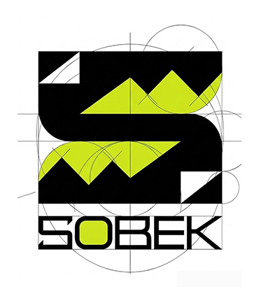
SOBEK complete brand identity
Sobek is a cosmetics startup built for athletes, from shampoo to shower gel. Road9 Media named the brand and crafted a sharp, high-energy identity that looks fast, tough, and Egyptian.
Brand Story
In myth, Sobek is the crocodile god tied to the Nile, protection, and pharaonic strength. We turned that bite into a letterform: an S built from angular jaws, with a zigzag crown of teeth cutting through it. The vivid green signals motion and stamina, while the black frame keeps it controlled and aggressive. The result feels less like a mascot and more like a symbol athletes can wear, print, and repeat.
High Contrast, High Pulse
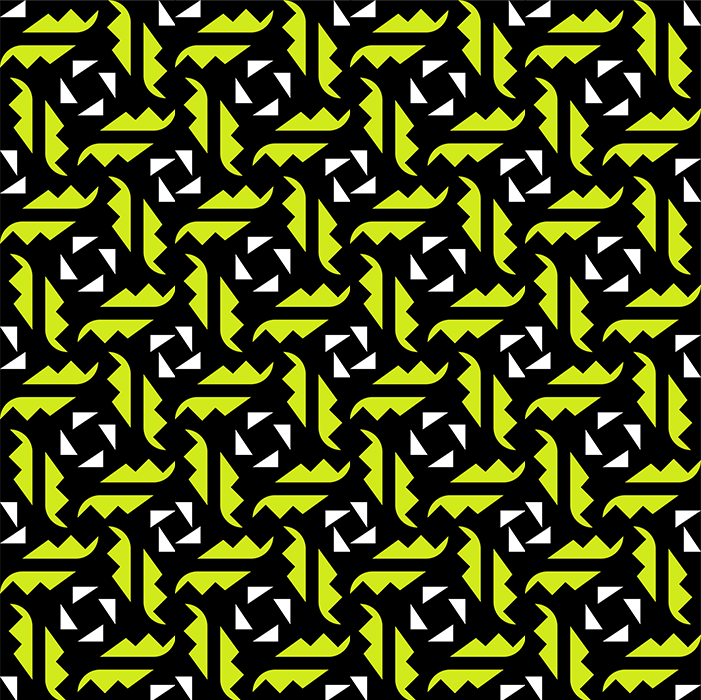
We built the system on three ingredients: matte black, clean white, and a vivid lime green. The icon breaks into triangles and tooth shapes that form a repeatable pattern, so every pack stays connected even when layouts change. The squared typography and the green “O” add a quick visual punch.
Built to Wrap and Repeat
We treated the mark like a stamp and the pattern like a grip texture. It scales from a small label badge to a full band wrapping the bottle, staying readable on curved surfaces. The neon cap and pattern blocks give instant shelf recognition, while the clean logo lockup keeps new products easy to extend.
A System That Can Outrun Trends
The identity is simple enough to survive refreshes, yet distinctive enough to own a shelf. One icon, one pattern language, and one electric accent color can scale across new products without losing cohesion.