
The Gentleman & More: Hair Styling Brand
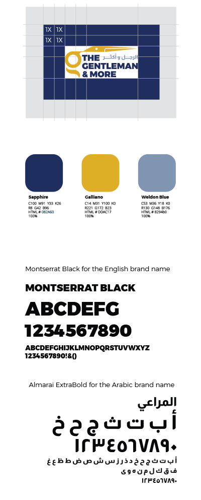
Visual identity for The Gentleman & More, a newly launched men’s barbershop. We built a bilingual logo system, palette, and typography that feel premium, masculine, and unmistakably barbershop.
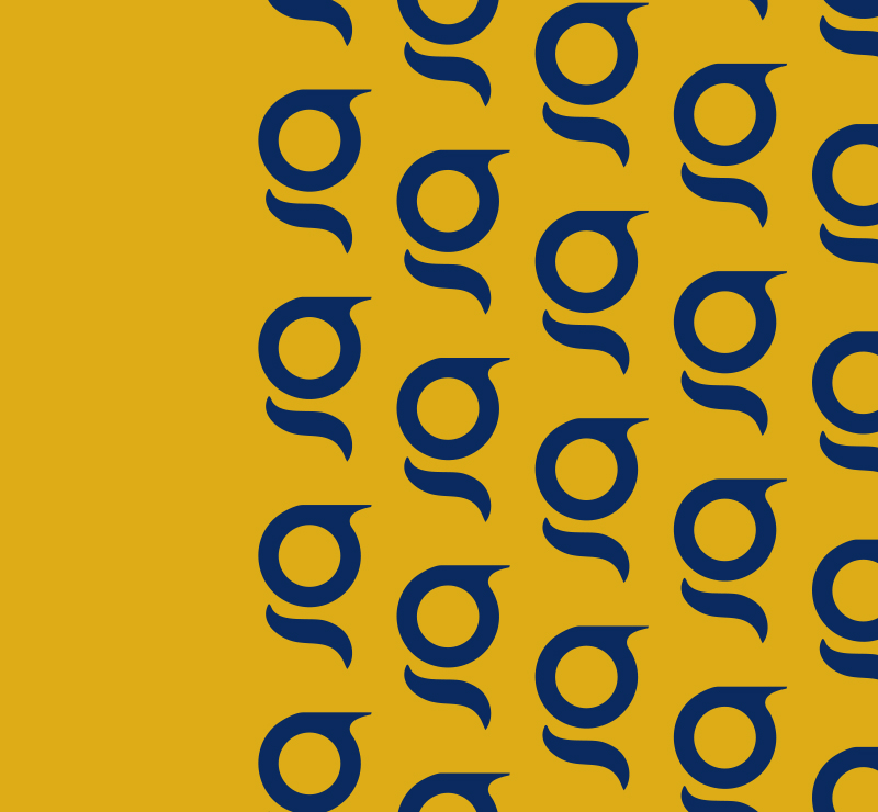
A Cut That Reads as G
Sapphire, Gold, and Calm Steel
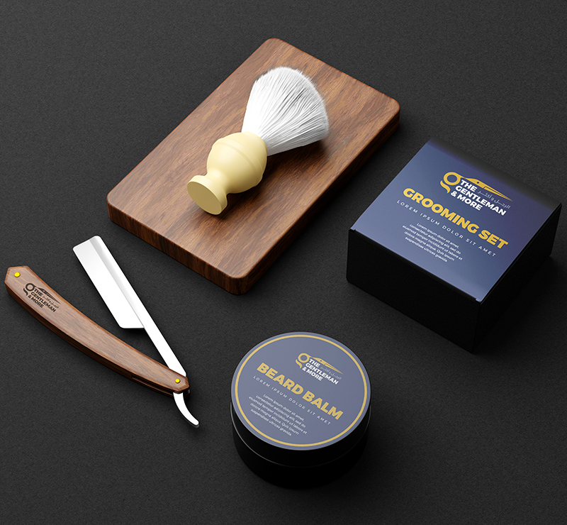
Designed to Live on Real Surfaces
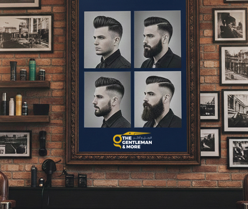
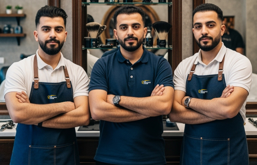
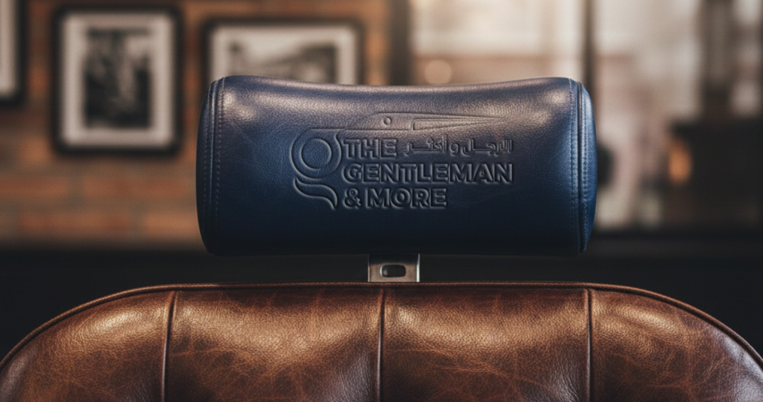
Barbershops are tactile, so we planned the logo for stitching, embossing, and print. The icon holds up as a small chest patch on aprons, and the full lockup stays legible on leather headrests, signage, and social templates. The system supports one-color versions for stamping and engraving, while the clear-space rules protect the mark in busy interiors.
Made for Long-Term Use
Simple geometry, heavy letterforms, and a tight three-color palette make the identity easy to reproduce and hard to date. It stays sharp in embroidery, foil, embossing, and digital, with bilingual flexibility for future branches.