Close menu
/

TAPTYPE: Medical Platform

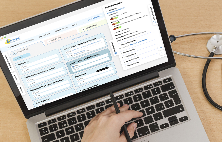
We named TapType, built its visual identity, and designed the platform UX for a connected healthcare workflow ecosystem that reduces documentation load and improves patient flow.

TAPTYPE: Medical Platform

Logo Concept: “The Clickable Note”

TapType started as a faster way to digitize a doctor’s note, so the logo is a document that behaves like software. The tilted “paper” signals clinical documentation, while the folded corner becomes a cursor-like point that hints at tap-first charting. Paired with a bold, all-caps wordmark, it reads clearly at small sizes but still feels energetic and modern, like a tool built to save time inside the consultation, not after it.

Brand Visual Identity: “Trust, With Momentum”

We built the identity around clean clinical whitespace, Montserrat typography, and a tight palette: confident blues for trust and structure, plus a sharp yellow accent for speed and progress. The angular “cursor shards” extend the logo idea into patterns and layouts, giving the brand a digital motion without losing medical credibility.
TAPTYPE: Medical Platform

One System, Many Touchpoints

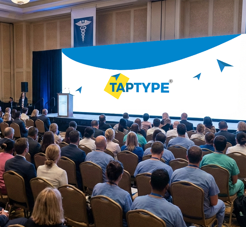
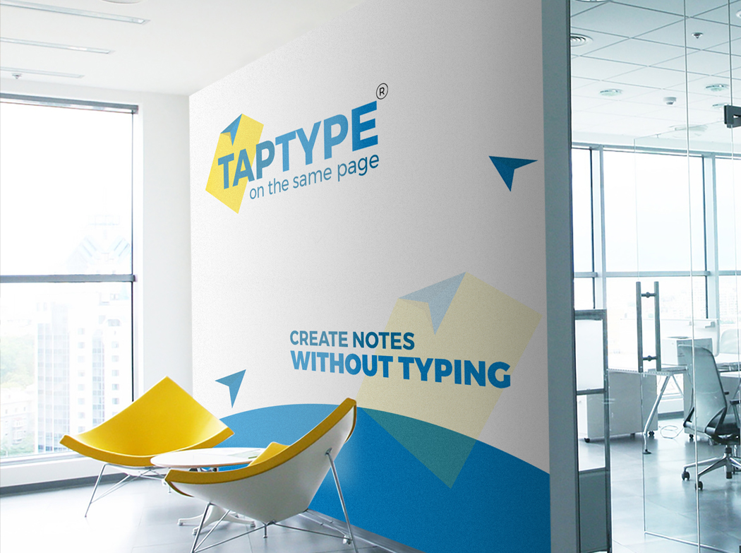
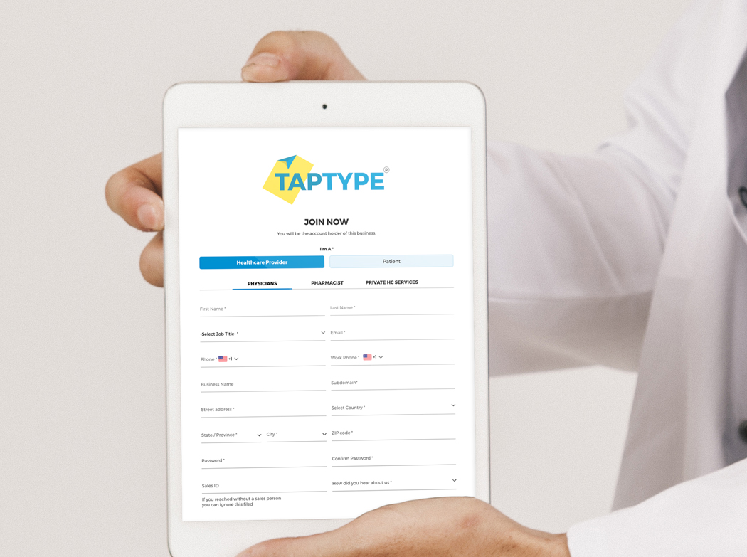
Because TapType lives across real clinics and real screens, we designed the brand to work everywhere: product UI, onboarding forms, sales decks, and large-format conference visuals. The logo stays stable, while the cursor fragments and curved color fields flex as a reusable design language for headers, sections, and feature storytelling across the ecosystem.

Durability

The mark is simple geometry with strong contrast, so it scales from an app icon to a stage backdrop. The modular shapes support future sub-products, while the type and palette keep everything recognizably TapType as the platform grows.

TAPTYPE: Medical Platform
TAPTYPE: Medical Platform TAPTYPE: Medical Platform