Arpu Plus Website UX design
We've built and managed all of Arpu Plus’ online presence, from building their website to handling their digital media channels and online ads.

The Client
ArpuPlus is one of A15 subsidiaries, operating in 12 countries in the field of mobile value-added services.
segment
Technology
type
Corporate website
market
Egypt
The Brief
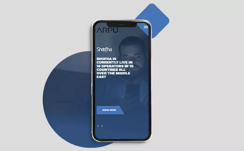
Revamping the website of the pioneering tech giant, in a way that represents their special kind of products in both B2C & B2B sectors, the design has to be unique and ultra-modern to communicate the dynamism of the company products & services.
The tech giant
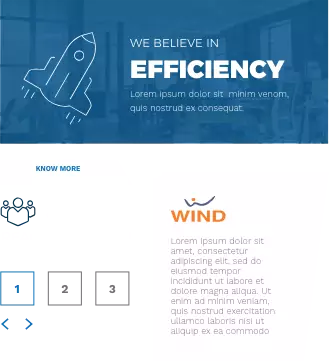
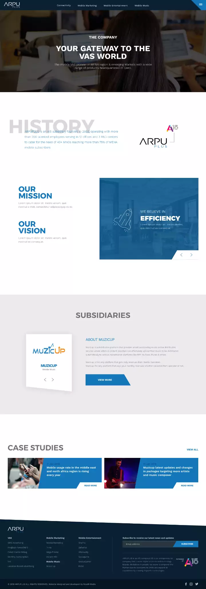
Based on the company brand shapes & colors, we've designed a user experience that reflects both modern and professional aspects of the brand.

Diversity
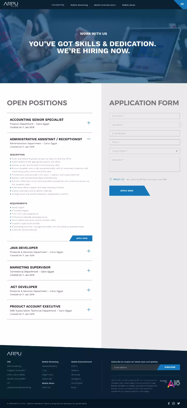
Using slightly different shapes and shades of blue, we created a unique experience for the tech giant’s various products and services with harmony between the screens at the same time.
Blue theme
Using the blue color -along with other neutral colors- unified the website into a consistent experience across its pages, and it also created an opportunity for users to memorize the brand color while navigating through the website.
